Requesting Display Mode Transitions in MCP Apps (May 2026)
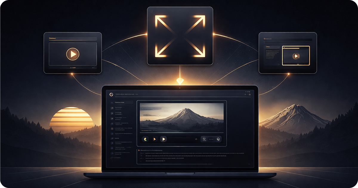
MCP App resources can request display mode transitions directly from user interactions.
TL;DR: Use useDisplayMode() to read the current mode and useRequestDisplayMode() to request changes and check which modes the host supports. Tie requests to user interactions, not component mount. Test all three modes in the sunpeak inspector without a paid account.
The display mode reference explains what inline, fullscreen, and picture-in-picture look like from the outside. This post covers the other direction: how your resource asks the host to change modes.
The use cases are common. A data table that needs more space. A code diff the user wants to study. A dashboard that works better without the conversation column. All of these want a button that says “expand.”
The Two Hooks
Reading and writing display mode involve two different hooks.
useDisplayMode returns the current mode as 'inline' | 'pip' | 'fullscreen'. It updates reactively when the host changes the mode, so your layout can adapt without any extra logic.
useRequestDisplayMode returns an object with two properties: requestDisplayMode (a function that asks the host to switch modes) and availableModes (an array of modes the host supports, or undefined while the connection is being established).
import { useDisplayMode, useRequestDisplayMode } from 'sunpeak';

export function MyResource() {
  const displayMode = useDisplayMode(); // 'inline' | 'pip' | 'fullscreen'
  const { requestDisplayMode, availableModes } = useRequestDisplayMode();

  const canFullscreen = availableModes?.includes('fullscreen') ?? false;

  const goFullscreen = () => {
    requestDisplayMode({ mode: 'fullscreen' });
  };

  return (
    <button onClick={goFullscreen} disabled={!canFullscreen}>
      Expand
    </button>
  );
}
The availableModes check is optional but useful. Some hosts or embedded contexts may not support every mode, and checking before you render a button avoids showing controls that do nothing.
The host decides whether to honor the request. In practice, hosts honor user-initiated transitions immediately.
Pattern 1: Expand to Fullscreen
The most common pattern: show an expand button in inline and PiP modes, hide it in fullscreen (where it has no effect).
import { useDisplayMode, useRequestDisplayMode, useToolData, SafeArea } from 'sunpeak';
import type { ResourceConfig } from 'sunpeak';

export const resource: ResourceConfig = {
  description: 'Display a data table',
};

interface TableData {
  columns: string[];
  rows: Array<Record<string, string>>;
  title: string;
}

export function TableResource() {
  const displayMode = useDisplayMode();
  const { requestDisplayMode, availableModes } = useRequestDisplayMode();
  const { output } = useToolData<unknown, TableData>(undefined, undefined);

  if (!output) return null;

  const isFullscreen = displayMode === 'fullscreen';
  const canFullscreen = availableModes?.includes('fullscreen') ?? false;

  return (
    <SafeArea
      style={{
        fontFamily: 'var(--font-sans)',
        background: 'var(--color-background-primary)',
        color: 'var(--color-text-primary)',
        padding: '1.25rem',
        height: '100%',
      }}
    >
      <div style={{ display: 'flex', alignItems: 'center', justifyContent: 'space-between', marginBottom: '0.75rem' }}>
        <h1 style={{ fontSize: 'var(--text-md)', fontWeight: 'var(--font-weight-semibold)', margin: 0 }}>
          {output.title}
        </h1>
        {!isFullscreen && canFullscreen && (
          <button
            onClick={() => requestDisplayMode({ mode: 'fullscreen' })}
            style={{
              fontSize: 'var(--text-xs)',
              color: 'var(--color-text-secondary)',
              background: 'var(--color-background-secondary)',
              border: '1px solid var(--color-border-primary)',
              borderRadius: 'var(--border-radius-sm)',
              padding: '0.25rem 0.5rem',
              cursor: 'pointer',
            }}
          >
            Expand
          </button>
        )}
      </div>

      <div style={{ overflowX: 'auto' }}>
        <table style={{ width: '100%', borderCollapse: 'collapse', fontSize: 'var(--text-sm)' }}>
          <thead>
            <tr>
              {output.columns.map((col) => (
                <th
                  key={col}
                  style={{
                    textAlign: 'left',
                    padding: '0.5rem 0.75rem',
                    borderBottom: '1px solid var(--color-border-primary)',
                    fontWeight: 'var(--font-weight-medium)',
                    color: 'var(--color-text-secondary)',
                  }}
                >
                  {col}
                </th>
              ))}
            </tr>
          </thead>
          <tbody>
            {output.rows.map((row, i) => (
              <tr key={i}>
                {output.columns.map((col) => (
                  <td
                    key={col}
                    style={{
                      padding: '0.5rem 0.75rem',
                      borderBottom: '1px solid var(--color-border-primary)',
                    }}
                  >
                    {row[col]}
                  </td>
                ))}
              </tr>
            ))}
          </tbody>
        </table>
      </div>
    </SafeArea>
  );
}
The !isFullscreen && canFullscreen check means the button only shows when the host supports fullscreen and the user isn’t already there. The host provides an X button to close, so you don’t need your own.
Pattern 2: Pop Out to PiP
PiP mode is useful for references the user wants to keep visible while continuing the conversation. A glossary, a running score, a status panel.
const { requestDisplayMode, availableModes } = useRequestDisplayMode();
const canPip = availableModes?.includes('pip') ?? false;

const handlePopOut = () => {
  requestDisplayMode({ mode: 'pip' });
};
One thing to know: the MCP Apps protocol allows PiP on any device, but some hosts (ChatGPT in particular) promote PiP to fullscreen on mobile screen widths. You do not need to handle this fallback yourself since the host manages it. If you want to know whether the user is on mobile, read useHostContext().platform:
import { useHostContext } from 'sunpeak';

const ctx = useHostContext();
const isMobile = ctx?.platform === 'mobile';
Pattern 3: Back to Inline
Some resources open in fullscreen or PiP by default and include a “Done” or “Close” button that returns to inline mode. This is less common because hosts provide their own close controls, but it works when you want a specific call-to-action at the end of a flow.
const { requestDisplayMode } = useRequestDisplayMode();

const handleClose = () => {
  requestDisplayMode({ mode: 'inline' });
};
A form that switches to fullscreen for editing and back to inline after submit is a natural fit for this pattern:
import { useDisplayMode, useRequestDisplayMode, useToolData, useAppState, SafeArea } from 'sunpeak';
import type { ResourceConfig } from 'sunpeak';

export const resource: ResourceConfig = {
  description: 'Edit a document',
};

interface DocumentData {
  id: string;
  title: string;
  body: string;
}

interface EditorState {
  saved: boolean;
}

export function EditorResource() {
  const displayMode = useDisplayMode();
  const { requestDisplayMode } = useRequestDisplayMode();
  const { output } = useToolData<unknown, DocumentData>(undefined, undefined);
  const [state, setState] = useAppState<EditorState>({ saved: false });

  if (!output) return null;

  if (state.saved) {
    return (
      <SafeArea style={{ padding: '1.25rem', fontFamily: 'var(--font-sans)', color: 'var(--color-text-secondary)', fontSize: 'var(--text-sm)' }}>
        Saved.
      </SafeArea>
    );
  }

  const handleOpen = () => requestDisplayMode({ mode: 'fullscreen' });
  const handleSave = () => {
    setState({ saved: true });
    requestDisplayMode({ mode: 'inline' });
  };

  return (
    <SafeArea
      style={{
        fontFamily: 'var(--font-sans)',
        background: 'var(--color-background-primary)',
        padding: '1.25rem',
        height: '100%',
        display: 'flex',
        flexDirection: 'column',
        gap: '0.75rem',
      }}
    >
      <div style={{ display: 'flex', alignItems: 'center', justifyContent: 'space-between' }}>
        <h1 style={{ fontSize: 'var(--text-md)', fontWeight: 'var(--font-weight-semibold)', margin: 0 }}>
          {output.title}
        </h1>
        {displayMode === 'inline' && (
          <button
            onClick={handleOpen}
            style={{
              fontSize: 'var(--text-xs)',
              color: 'var(--color-text-secondary)',
              background: 'var(--color-background-secondary)',
              border: '1px solid var(--color-border-primary)',
              borderRadius: 'var(--border-radius-sm)',
              padding: '0.25rem 0.5rem',
              cursor: 'pointer',
            }}
          >
            Edit
          </button>
        )}
      </div>

      {displayMode === 'fullscreen' && (
        <>
          <textarea
            defaultValue={output.body}
            style={{
              flex: 1,
              fontFamily: 'var(--font-mono)',
              fontSize: 'var(--text-sm)',
              background: 'var(--color-background-secondary)',
              border: '1px solid var(--color-border-primary)',
              borderRadius: 'var(--border-radius-md)',
              padding: '0.75rem',
              color: 'var(--color-text-primary)',
              resize: 'none',
            }}
          />
          <button
            onClick={handleSave}
            style={{
              alignSelf: 'flex-end',
              padding: '0.5rem 1rem',
              background: 'var(--color-background-info)',
              color: 'var(--color-text-info)',
              border: '1px solid var(--color-border-info)',
              borderRadius: 'var(--border-radius-md)',
              fontSize: 'var(--text-sm)',
              fontWeight: 'var(--font-weight-medium)',
              cursor: 'pointer',
            }}
          >
            Save
          </button>
        </>
      )}
    </SafeArea>
  );
}
This resource shows a title with an “Edit” button in inline mode. Clicking “Edit” opens fullscreen. Clicking “Save” marks the document saved and returns to inline. The model sees { saved: true } via useAppState and can continue the conversation from there.
Combining useDisplayMode and useRequestDisplayMode
useDisplayMode and useRequestDisplayMode compose naturally. Read the current mode to decide what to show, use requestDisplayMode and availableModes to offer the right controls:
import { useDisplayMode, useRequestDisplayMode } from 'sunpeak';

function ModeControls() {
  const displayMode = useDisplayMode();
  const { requestDisplayMode, availableModes } = useRequestDisplayMode();

  const canPip = availableModes?.includes('pip') ?? false;
  const canFullscreen = availableModes?.includes('fullscreen') ?? false;

  if (displayMode === 'fullscreen') return null; // host provides close button

  return (
    <div style={{ display: 'flex', gap: '0.5rem' }}>
      {displayMode === 'inline' && (
        <>
          {canPip && (
            <button onClick={() => requestDisplayMode({ mode: 'pip' })}>
              Pop out
            </button>
          )}
          {canFullscreen && (
            <button onClick={() => requestDisplayMode({ mode: 'fullscreen' })}>
              Expand
            </button>
          )}
        </>
      )}
      {displayMode === 'pip' && canFullscreen && (
        <button onClick={() => requestDisplayMode({ mode: 'fullscreen' })}>
          Fullscreen
        </button>
      )}
    </div>
  );
}
This renders two buttons from inline (when supported), one from PiP, and nothing from fullscreen. Each maps to a mode that provides more space than the current one. The availableModes checks mean this component adapts automatically if a host only supports a subset of modes.
Testing Display Mode Transitions
The sunpeak inspector sidebar has a display mode dropdown. Toggle it to verify your layout adapts correctly in each mode. For automated tests, pass displayMode as an option to inspector.renderTool:
import { test, expect } from 'sunpeak/test';

const displayModes = ['inline', 'pip', 'fullscreen'] as const;

for (const displayMode of displayModes) {
  test(`table renders expand button in ${displayMode}`, async ({ inspector }) => {
    const result = await inspector.renderTool('show-table', undefined, { displayMode });
    const app = result.app();

    if (displayMode === 'fullscreen') {
      await expect(app.locator('text=Expand')).not.toBeVisible();
    } else {
      await expect(app.locator('text=Expand')).toBeVisible();
    }
  });
}
To test the transition itself, click the button inside the iframe. The inspector processes requestDisplayMode calls the same way a real host does:
test('clicking expand requests fullscreen', async ({ inspector }) => {
  const result = await inspector.renderTool('show-table', undefined, { displayMode: 'inline' });
  const app = result.app();
  await app.locator('text=Expand').click();

  await expect(app.locator('text=Expand')).not.toBeVisible();
});
You can also mock useRequestDisplayMode directly in unit tests. This is useful when you want to test your component logic without running the full inspector:
vi.mock('sunpeak', () => ({
  useDisplayMode: () => 'inline',
  useRequestDisplayMode: () => ({
    requestDisplayMode: vi.fn(),
    availableModes: ['inline', 'fullscreen'],
  }),
}));
The mocking and stubbing guide covers more patterns for isolating display mode behavior in tests.
No paid ChatGPT or Claude accounts required. The inspector handles mode transitions locally, so these tests run in CI.
A Few Practical Notes
The host is not required to honor every requestDisplayMode call. If your resource is in a context where fullscreen is unavailable (say, an embedded integration), the request may be ignored. useDisplayMode will stay at the current value. Checking availableModes before showing a mode-switch button prevents dead buttons in your UI.
Tying requests to user interactions is more reliable than calling requestDisplayMode on mount. Hosts may deprioritize or ignore requests that are not triggered by a user gesture, and auto-expanding without user intent is generally bad UX.
The request is asynchronous in the sense that requestDisplayMode does not block. The mode change comes back as a useDisplayMode update when the host processes it. You do not need to manage a pending state yourself.
Build MCP Apps that use the full screen when they need it with sunpeak. npx sunpeak new to get started.
Get Started
npx sunpeak newFurther Reading
- Display mode reference - exact HTML/CSS layouts for inline, PiP, and fullscreen
- MCP App styling guide - CSS variables for every mode and theme
- Interactive MCP Apps with useAppState - pair state management with display mode transitions
- Complete guide to testing ChatGPT Apps and MCP Apps
- Cross-host compatibility testing for MCP Apps
- Mocking and stubbing in MCP App tests - including display mode mocks
- E2E testing MCP Apps, ChatGPT Apps, and Claude Connectors
- MCP App framework - cross-host portability features
- MCP Apps launch partners - Figma, Asana, Slack, and more
Frequently Asked Questions
How do I make my MCP App go fullscreen?
Import useRequestDisplayMode from sunpeak. Call const { requestDisplayMode, availableModes } = useRequestDisplayMode(). Then call requestDisplayMode({ mode: "fullscreen" }) in a click handler. Check availableModes?.includes("fullscreen") first to confirm the host supports it. Pair it with useDisplayMode to read the current mode and adapt your layout after the transition completes.
What is useRequestDisplayMode in sunpeak?
useRequestDisplayMode is a sunpeak React hook that returns an object with requestDisplayMode (a function to request mode changes) and availableModes (an array of modes the host supports, or undefined while connecting). It replaces the older pattern of calling app.requestDisplayMode through the useApp hook. Import it from sunpeak alongside useDisplayMode and useToolData.
What display modes can an MCP App request?
MCP App resources can request three display modes: "inline" (embedded in the conversation), "pip" (picture-in-picture floating window), and "fullscreen" (takes over the conversation area). The host decides whether to honor the request. ChatGPT promotes PiP requests to fullscreen on mobile screen widths, though this is a host implementation choice, not a protocol requirement.
What is the difference between useDisplayMode and useRequestDisplayMode?
useDisplayMode reads the current display mode as a string ("inline", "pip", or "fullscreen"). useRequestDisplayMode gives you requestDisplayMode (to request a new mode) and availableModes (to check which modes the host supports). Use both together: read with useDisplayMode to decide what to render, write with useRequestDisplayMode to request changes on user interaction.
How do I add an expand button to my MCP App resource?
Read the current mode with useDisplayMode and get requestDisplayMode from useRequestDisplayMode. When the user clicks your expand button, call requestDisplayMode({ mode: "fullscreen" }). Show or hide the button based on the current mode. Hide it when already in fullscreen so it only appears when it has an effect.
Does MCP App PiP mode work on mobile?
It depends on the host. The MCP Apps protocol allows PiP on any device, but ChatGPT promotes PiP to fullscreen on mobile screen widths. If you call requestDisplayMode({ mode: "pip" }) on mobile in ChatGPT, the host shows fullscreen instead. Other hosts may handle this differently. You do not need to handle this fallback yourself since the host manages it.
How do I test display mode transitions in the sunpeak inspector?
Use the display mode dropdown in the sunpeak inspector sidebar to toggle between inline, pip, and fullscreen and verify your layout adapts correctly. For automated tests, pass the displayMode option to inspector.renderTool in your test file. Loop over all three modes to cover every transition without a paid ChatGPT or Claude account.
How do I check which display modes are available before requesting one?
Use the availableModes property from useRequestDisplayMode. It returns an array of supported mode strings or undefined while the connection is being established. Check availableModes?.includes("fullscreen") before showing an expand button. This lets you build UI that adapts to what the host actually supports rather than hard-coding assumptions.
