Interactive MCP Apps: Building Two-Way UIs with useAppState (May 2026)
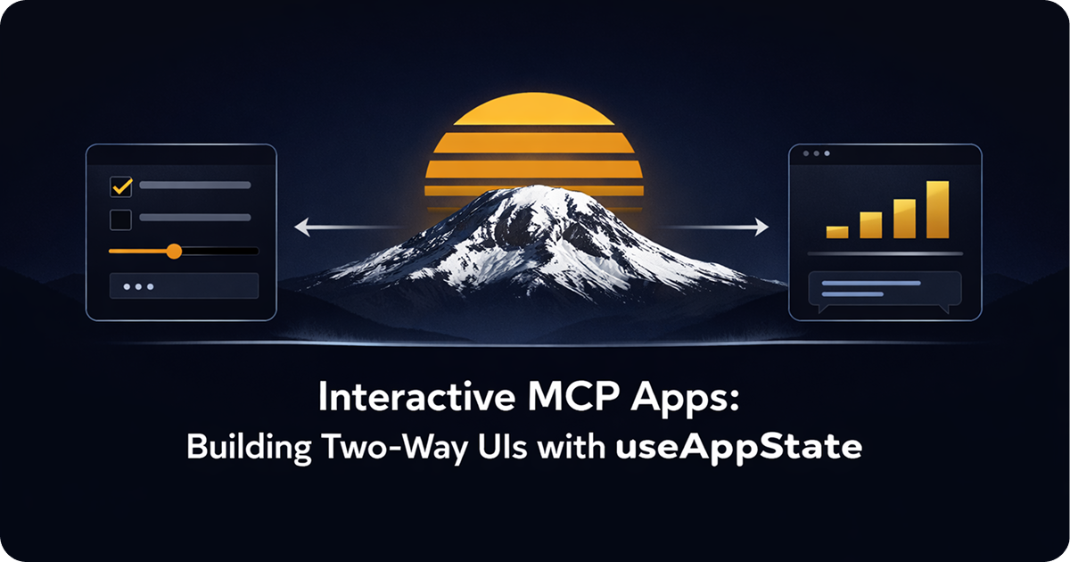
Build UIs that can be interacted with by humans or agents with sunpeak.
TL;DR: useAppState works like React useState but syncs to the AI host. The model can read the current state, so user actions (button clicks, form fills, checkbox checks) become information the model can act on. Import it from sunpeak alongside useToolData.
Every tutorial for MCP Apps starts with the same shape: tool returns data, component renders it as a card. That covers a lot of apps. But it leaves out the interactive half of the picture.
When a user clicks “Approve,” the model should know they clicked “Approve.” When a user checks three items off a list, the model should see which three. useAppState is how that works in MCP Apps across ChatGPT, Claude, VS Code, and Goose.
Why Not Just useState
React useState is local to the component instance. The host does not know about it. It disappears when the iframe reloads. For UI-only state like open/closed panels or hover effects, that is fine.
useAppState does something different: it syncs state to the host through updateModelContext. When the state changes, the host stores it and makes it available to the model. The model can then respond based on what the user did.
Under the hood, the hosts handle this differently. ChatGPT uses an imperative window.openai.setWidgetState API for widget state persistence and ui/update-model-context to expose state to the model. Claude uses the MCP Apps state syncing protocol. useAppState wraps both into one React hook so you write the same code regardless of which host runs your app.
The hook signature is almost identical to useState:
import { useAppState } from 'sunpeak';

const [state, setState] = useAppState({ confirmed: false });
The difference is that setState sends the new state to the host, not just a local re-render. This state is durable across iframe reloads and readable by the model.
Use useState for: hover states, open/closed panels, animation triggers.
Use useAppState for: decisions, selections, form values, anything the model needs to see.
A Practical Example: Approval Flow
The most common interactive pattern in the Connectors Directory and the ChatGPT App Store is an approval flow. The model shows a review card. The user confirms or rejects. The model acts on the decision.
Here is a simple approval component. It shows a proposal and two buttons. The model knows which button the user pressed.
import { useToolData, useAppState, SafeArea } from 'sunpeak';
import type { ResourceConfig } from 'sunpeak';

export const resource: ResourceConfig = {
  title: 'Approval',
  description: 'Request user confirmation before taking an action',
};

interface ApprovalData {
  title: string;
  description: string;
  confirmLabel?: string;
  cancelLabel?: string;
}

interface ApprovalState {
  decision: 'confirmed' | 'cancelled' | null;
  decidedAt: string | null;
}

export function ApprovalResource() {
  const { output } = useToolData<unknown, ApprovalData>(undefined, undefined);
  const [state, setState] = useAppState<ApprovalState>({
    decision: null,
    decidedAt: null,
  });

  if (!output) return null;

  const handleConfirm = () => {
    setState({ decision: 'confirmed', decidedAt: new Date().toISOString() });
  };

  const handleCancel = () => {
    setState({ decision: 'cancelled', decidedAt: new Date().toISOString() });
  };

  return (
    <SafeArea className="p-5 font-sans max-w-sm mx-auto space-y-4">
      <div>
        <h1 className="text-lg font-bold">{output.title}</h1>
        <p className="text-sm text-gray-600 mt-1">{output.description}</p>
      </div>

      {state.decision === null ? (
        <div className="flex gap-3">
          <button
            onClick={handleCancel}
            className="flex-1 py-2 px-4 rounded-lg border border-gray-300 text-sm font-medium"
          >
            {output.cancelLabel ?? 'Cancel'}
          </button>
          <button
            onClick={handleConfirm}
            className="flex-1 py-2 px-4 rounded-lg bg-blue-600 text-white text-sm font-medium"
          >
            {output.confirmLabel ?? 'Confirm'}
          </button>
        </div>
      ) : (
        <div className="text-center py-2">
          <p className="font-medium text-green-700">
            {state.decision === 'confirmed' ? 'Confirmed' : 'Cancelled'}
          </p>
          {state.decidedAt && (
            <p className="text-xs text-gray-400 mt-1">
              {new Date(state.decidedAt).toLocaleTimeString()}
            </p>
          )}
        </div>
      )}
    </SafeArea>
  );
}
The tool that triggers this resource passes the title and description as structuredContent. After the user clicks, the model sees { decision: 'confirmed', decidedAt: '...' } and can act accordingly, such as completing a purchase, sending a message, or executing a write operation.
The tool looks like this:
// src/tools/request-approval.ts
import { z } from 'zod';
import type { AppToolConfig, ToolHandlerExtra } from 'sunpeak/mcp';

export const tool: AppToolConfig = {
  resource: 'approval',
  title: 'Request Approval',
  description: 'Show a confirmation dialog before taking an irreversible action',
  annotations: { destructiveHint: true },
};

export const schema = {
  title: z.string().describe('Action title'),
  description: z.string().describe('What will happen if the user confirms'),
  confirmLabel: z.string().optional().describe('Confirm button text'),
  cancelLabel: z.string().optional().describe('Cancel button text'),
};

type Args = z.infer<z.ZodObject<typeof schema>>;

export default async function (args: Args, _extra: ToolHandlerExtra) {
  return {
    structuredContent: {
      title: args.title,
      description: args.description,
      confirmLabel: args.confirmLabel ?? 'Confirm',
      cancelLabel: args.cancelLabel ?? 'Cancel',
    },
  };
}
Note destructiveHint: true in the annotations. The approval resource is typically used before destructive actions, so this annotation is correct and required for Connectors Directory submission.
setState: Replacement and Functional Updates
setState from useAppState accepts two forms, just like React’s useState.
You can pass a full replacement object:
setState({ decision: 'confirmed', decidedAt: new Date().toISOString() });Or you can pass a callback that receives the previous state:
setState(prev => ({ ...prev, decision: 'confirmed', decidedAt: new Date().toISOString() }));The callback form is useful when you have many fields and only want to update a few, because it avoids accidentally dropping fields. Either way, the new state replaces the old state entirely. There is no shallow merge like React class component setState.
For complex state with many fields, the callback pattern keeps things readable:
const [state, setState] = useAppState({ step: 1, answers: {}, complete: false });

// Advance to step 2 without losing answers
setState(prev => ({ ...prev, step: 2 }));
A Checklist Example
Here is a checklist where the user checks items off a list and the model knows which are done:
import { useToolData, useAppState, SafeArea } from 'sunpeak';
import type { ResourceConfig } from 'sunpeak';

export const resource: ResourceConfig = {
  title: 'Checklist',
  description: 'Interactive task checklist with model-visible completion state',
};

interface ChecklistData {
  title: string;
  items: Array<{ id: string; label: string }>;
}

interface ChecklistState {
  checked: string[];
}

export function ChecklistResource() {
  const { output } = useToolData<unknown, ChecklistData>(undefined, undefined);
  const [state, setState] = useAppState<ChecklistState>({ checked: [] });

  if (!output) return null;

  const toggle = (id: string) => {
    setState(prev => {
      const checked = prev.checked.includes(id)
        ? prev.checked.filter((c) => c !== id)
        : [...prev.checked, id];
      return { checked };
    });
  };

  return (
    <SafeArea className="p-5 font-sans max-w-sm mx-auto">
      <h1 className="text-lg font-bold mb-3">{output.title}</h1>
      <ul className="space-y-2">
        {output.items.map((item) => {
          const done = state.checked.includes(item.id);
          return (
            <li key={item.id}>
              <label className="flex items-center gap-3 cursor-pointer">
                <input
                  type="checkbox"
                  checked={done}
                  onChange={() => toggle(item.id)}
                  className="w-4 h-4 rounded"
                />
                <span className={done ? 'line-through text-gray-400' : ''}>{item.label}</span>
              </label>
            </li>
          );
        })}
      </ul>
      <p className="text-xs text-gray-400 mt-4">
        {state.checked.length} of {output.items.length} complete
      </p>
    </SafeArea>
  );
}
Every time the user checks or unchecks an item, the model receives an updated checked array. The model can say “You’ve finished 3 of 5 steps, want to continue?” based on the actual state.
Adding Test Data
Add a simulation file at tests/simulations/request-approval.json:
{
  "tool": "request-approval",
  "userMessage": "Delete the old production snapshots",
  "toolInput": {
    "title": "Delete production snapshots",
    "description": "This will permanently delete 14 snapshots from January 2025. This cannot be undone.",
    "confirmLabel": "Delete",
    "cancelLabel": "Keep them"
  },
  "toolResult": {
    "structuredContent": {
      "title": "Delete production snapshots",
      "description": "This will permanently delete 14 snapshots from January 2025. This cannot be undone.",
      "confirmLabel": "Delete",
      "cancelLabel": "Keep them"
    }
  }
}
Run pnpm dev and open http://localhost:3000. The approval card renders. Click “Delete” and watch the state update to the confirmed view. The sunpeak Inspector shows the current useAppState value in the sidebar so you can verify what the model sees.
Testing Interactive State
For unit tests, use Vitest and @testing-library/react to test state transitions. Mock useAppState alongside useToolData:
import { describe, it, expect, vi } from 'vitest';
import { render, screen, fireEvent } from '@testing-library/react';
import { ApprovalResource } from './approval';

let currentState = { decision: null, decidedAt: null };
const mockSetState = vi.fn((newState) => {
  currentState = newState;
});

vi.mock('sunpeak', () => ({
  useToolData: () => ({
    output: {
      title: 'Delete production snapshots',
      description: 'This will permanently delete 14 snapshots.',
      confirmLabel: 'Delete',
      cancelLabel: 'Keep them',
    },
    input: null,
    inputPartial: null,
    isError: false,
    isLoading: false,
    isCancelled: false,
    cancelReason: null,
  }),
  useAppState: () => [currentState, mockSetState],
  useHostContext: () => null,
  useDisplayMode: () => 'inline',
  SafeArea: ({ children, ...props }: any) => <div {...props}>{children}</div>,
}));

describe('ApprovalResource', () => {
  it('calls setState with confirmed decision on confirm click', () => {
    render(<ApprovalResource />);
    fireEvent.click(screen.getByText('Delete'));
    expect(mockSetState).toHaveBeenCalledWith(
      expect.objectContaining({ decision: 'confirmed' })
    );
  });

  it('calls setState with cancelled decision on cancel click', () => {
    currentState = { decision: null, decidedAt: null };
    render(<ApprovalResource />);
    fireEvent.click(screen.getByText('Keep them'));
    expect(mockSetState).toHaveBeenCalledWith(
      expect.objectContaining({ decision: 'cancelled' })
    );
  });
});
For end-to-end tests, click the button inside the inspector iframe and assert that the confirmed state renders:
import { test, expect } from 'sunpeak/test';

test('approval resource shows confirmed state after clicking confirm', async ({ inspector }) => {
  const result = await inspector.renderTool('request-approval', {});
  const app = result.app();
  await app.locator('text=Delete').click();
  await expect(app.locator('text=Confirmed')).toBeVisible();
});
The same test runs against the Claude host by swapping host: 'claude' in your Playwright project config. The sunpeak testing framework runs both host runtimes locally without accounts, API keys, or credits on your CI runners. See the cross-host testing guide for full matrix testing patterns.
Where State Lives After the Decision
Once the user acts, useAppState holds their decision for the lifetime of the resource in that conversation. If the model shows the same resource again (same tool call reloaded), the state resets to the initial value because each tool invocation creates a fresh resource instance.
This is the right behavior for most apps. An approval flow should start fresh each time. A checklist that persists across conversations would require the model to write the state somewhere durable (a database, a tool call result) and pass it back as tool input on the next invocation.
On ChatGPT, widgets are message-scoped. Each response creates a fresh instance, and widget state restores when the user reopens the same message. Claude and VS Code handle scoping the same way through the MCP Apps protocol. The point is that useAppState is per-resource-instance, not global, and sunpeak handles the host-specific persistence details for you.
When Not to Use useAppState
useAppState is for state the model needs to see. If the state only affects visual presentation and the model does not need to know about it, useState is simpler.
Display mode changes go through useApp not useAppState. To request fullscreen:
const app = useApp();
app?.requestDisplayMode({ mode: 'fullscreen' });
Read-only displays that adapt to host context use useHostContext and useDisplayMode, neither of which write state.
ChatGPT also has host-specific hooks for platform features: useUploadFile for adding files to the conversation, useRequestModal for host-controlled modals, and useRequestCheckout for payments. These are separate from useAppState because they trigger host actions rather than syncing state to the model. Guard them with isChatGPT() since they only work on ChatGPT. See the display mode reference for details on host-specific behavior.
The right mental model: useAppState is the outbound channel from user to model. useToolData is the inbound channel from model to user. Together they cover the full interaction loop for any MCP App.
Get Started
npx sunpeak newFurther Reading
- MCP App tutorial - build and test your first MCP App from scratch
- How to build an MCP App - architecture guide for cross-host interactive UI
- Unit testing MCP Apps - test useAppState and useToolData with Vitest
- E2E testing MCP Apps - cross-host inspector tests with Playwright
- Display mode reference - inline, fullscreen, and picture-in-picture modes
- useAppState hook reference - full API documentation
- MCP Apps introduction - protocol architecture and runtime capabilities
Frequently Asked Questions
What is useAppState in sunpeak?
useAppState is a React hook from sunpeak that manages persistent state in an MCP App resource. Unlike React useState, which is local to the component and lost on reload, useAppState syncs state to the AI host via updateModelContext. The AI model can read the current state and respond to user actions like button clicks, form submissions, or checkbox selections. It works across ChatGPT, Claude, VS Code, and Goose without host-specific code.
What is the difference between useState and useAppState in MCP Apps?
React useState is local to the component and discarded when the iframe reloads. useAppState persists across reloads and syncs to the AI host, so the model can see the current state. Use useState for UI-only state (open/closed panels, hover effects). Use useAppState for anything the model needs to know about: decisions, selections, form values, or user confirmations.
How does the AI model read useAppState?
When the user changes app state via useAppState, the hook calls updateModelContext to pass the updated state to the host. The host stores it and includes it in the model context. The model can then respond based on the current state, for example completing a transaction after the user confirms, sending a message after the user approves a draft, or adjusting its recommendations based on selected filters.
What does the useAppState API look like?
useAppState works like useState but takes an initial state object and returns a readonly [state, setState] tuple. Example: const [state, setState] = useAppState({ confirmed: false }). The setState function accepts either a full replacement object or a callback function like setState(prev => ({ ...prev, confirmed: true })). Import it from sunpeak alongside useToolData.
Does useAppState work the same on ChatGPT and Claude?
Yes. useAppState is part of the core sunpeak import, which is fully host-agnostic. Under the hood, ChatGPT uses an imperative window.openai.setWidgetState API while Claude uses MCP Apps state syncing, but sunpeak abstracts these differences into one React hook. State syncing works the same on ChatGPT, Claude, Goose, and VS Code. You do not need host-specific code to use useAppState.
How do I test interactive MCP App state with sunpeak?
Use Vitest with @testing-library/react to test state changes in your component. Mock useAppState alongside useToolData in your test file. For end-to-end tests, sunpeak testing framework renders your resource in the inspector iframe, where you can click buttons and assert state-dependent UI changes. Run pnpm test to execute both unit and e2e tests, and use the cross-host matrix to verify state works on both ChatGPT and Claude runtimes.
What are common use cases for useAppState in MCP Apps?
Common use cases include approval flows (user confirms or rejects an action), multi-step forms (user fills in fields and submits), preference selectors (user picks options the model uses to adjust behavior), task checklists (user marks items done), and pagination or filter controls (user navigates a dataset and the model tracks their position). These patterns are used in production by interactive Claude Connectors and ChatGPT Apps.
Can I use useAppState and useToolData together in the same component?
Yes, and that is the typical pattern. useToolData provides the initial data from the AI model (the tool output, including structured content). useAppState manages state that the user can update and the model can read. Together they cover the full request-response and interaction cycle for an MCP App resource.
