MCP App Styling: Host CSS Variables, Dark Mode, and Native-Looking UIs (May 2026)
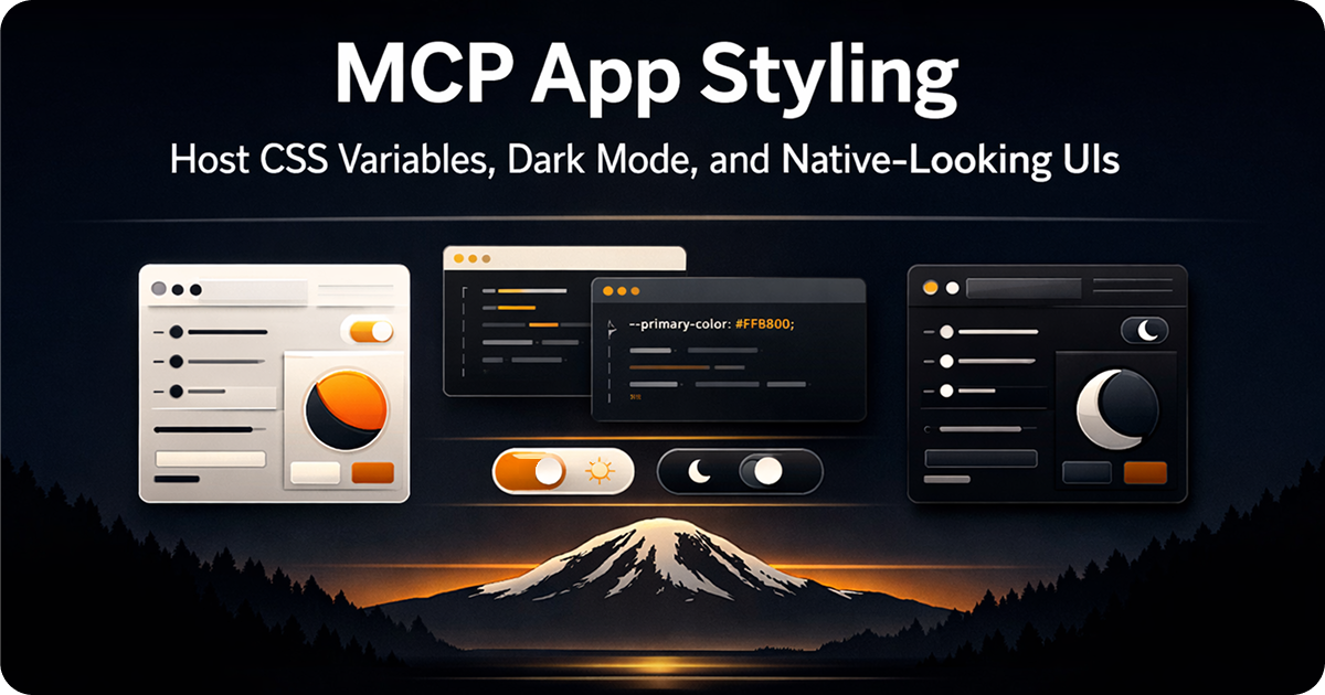
MCP App resources styled with host CSS variables look native in ChatGPT and Claude.
TL;DR: Use useTheme to detect dark or light mode. Use the host-provided CSS variables (--color-background-primary, --color-text-primary, --font-sans, etc.) for colors, typography, and spacing. Your component then matches each host’s visual style automatically, in both themes, across ChatGPT, Claude, Microsoft 365 Copilot, VS Code, Goose, and any future MCP App host.
When developers first build an MCP App, they focus on functionality: the tool returns data, the component renders it. Then they open the inspector, switch to dark mode, and see white cards on a dark background. Their app looks out of place.
The fix is not complicated. MCP App hosts publish a design token system through CSS variables. Use those variables instead of hardcoded colors and your component looks native in any host, in any theme, without conditional logic. This works on ChatGPT, Claude, Microsoft 365 Copilot, VS Code, Goose, and every other host that implements the MCP Apps standard.
useTheme: The Simple Case
If you just need to branch on light vs dark, useTheme is the hook for it.
import { useTheme, useToolData, SafeArea } from 'sunpeak';

export function StatusResource() {
  const theme = useTheme(); // 'light' | 'dark'
  const { output } = useToolData<unknown, { status: string; message: string }>(undefined, undefined);

  if (!output) return null;

  return (
    <SafeArea
      className={`p-5 font-sans ${theme === 'dark' ? 'bg-gray-900 text-white' : 'bg-white text-gray-900'}`}
    >
      <p className="text-sm font-medium">{output.status}</p>
      <p className="text-sm mt-1">{output.message}</p>
    </SafeArea>
  );
}
This works. But you’re now maintaining two color branches. If you use this pattern across a large app, you end up with a lot of ternaries.
The host CSS variables eliminate that entirely.
Host CSS Variables: Use the Design System the Host Already Has
Every MCP App host injects CSS variables into your iframe. These variables represent the host’s design tokens and update automatically when the theme changes. You reference them with var() and the host handles the rest.
The variable categories:
Colors
/* Backgrounds */
--color-background-primary
--color-background-secondary
--color-background-tertiary
--color-background-inverse
--color-background-ghost

/* Text */
--color-text-primary
--color-text-secondary
--color-text-tertiary
--color-text-inverse
--color-text-ghost

/* Borders */
--color-border-primary
--color-border-secondary

/* Semantic states */
--color-background-info
--color-background-danger
--color-background-success
--color-background-warning
--color-background-disabled
--color-text-info
--color-text-danger
--color-text-success
--color-text-warning
--color-text-disabled
--color-border-info
--color-border-danger
--color-border-success
--color-border-warning
--color-border-disabled
Focus rings
These are useful for accessible, theme-aware focus indicators on interactive elements.
--color-ring-primary
--color-ring-secondary
--color-ring-inverse
--color-ring-info
--color-ring-danger
--color-ring-success
--color-ring-warning
Typography
--font-sans
--font-mono
--font-weight-normal
--font-weight-medium
--font-weight-semibold
--font-weight-bold

/* Text sizes — each comes with a matching line height */
--text-xs
--text-sm
--text-md
--text-lg

/* Heading sizes */
--heading-xs
--heading-sm
--heading-md
--heading-lg
--heading-xl
--heading-2xl
--heading-3xl
Spacing and decoration
--border-radius-xs
--border-radius-sm
--border-radius-md
--border-radius-lg
--border-radius-xl
--border-radius-full

--border-width-regular

--shadow-hairline
--shadow-sm
--shadow-md
--shadow-lg
All variables are optional. Hosts may provide any subset depending on their implementation. Use sensible fallbacks where needed. See the full CSS Variables reference for details.
Rewriting the Status Card With Variables
Here is the same status card using variables instead of conditional classes:
import { useToolData, SafeArea } from 'sunpeak';
import type { ResourceConfig } from 'sunpeak';

export const resource: ResourceConfig = {
  description: 'Show a status message',
};

interface StatusData {
  status: string;
  message: string;
  level: 'info' | 'success' | 'warning' | 'danger';
}

export function StatusResource() {
  const { output } = useToolData<unknown, StatusData>(undefined, undefined);

  if (!output) return null;

  return (
    <SafeArea
      style={{
        padding: '1.25rem',
        fontFamily: 'var(--font-sans)',
        background: 'var(--color-background-primary)',
        color: 'var(--color-text-primary)',
      }}
    >
      <div
        style={{
          padding: '0.75rem 1rem',
          borderRadius: 'var(--border-radius-md)',
          border: '1px solid var(--color-border-primary)',
          background: `var(--color-background-${output.level})`,
          color: `var(--color-text-${output.level})`,
        }}
      >
        <p style={{ fontSize: 'var(--text-sm)', fontWeight: 'var(--font-weight-medium)' }}>
          {output.status}
        </p>
        <p style={{ fontSize: 'var(--text-sm)', marginTop: '0.25rem', color: 'var(--color-text-secondary)' }}>
          {output.message}
        </p>
      </div>
    </SafeArea>
  );
}
No useTheme. No ternaries. The colors adapt to light and dark mode because the host CSS variables change when the theme changes. The semantic variants (--color-background-danger, --color-text-success) give you state-aware styling without hardcoding red or green.
SafeArea and the Host Font
SafeArea from sunpeak is the right root element for almost every resource. It handles safe rendering boundaries, padding for safe area insets, correct box model behavior, and host style injection across all hosts.
One thing it does not do automatically: set the font. The host injects font-face definitions for --font-sans and --font-mono into your iframe, but you need to apply the variable:
<SafeArea style={{ fontFamily: 'var(--font-sans)' }}>
  {/* content */}
</SafeArea>
Without this, your component uses the iframe default font (usually Times New Roman). With it, your component uses the same typeface as the ChatGPT or Claude interface.
If you’re not using SafeArea as your root element, you can use the useHostStyles hook to apply the host’s CSS variables, theme, and font-face definitions to your component. This is useful for cases where you need the styling plumbing without the layout wrapper.
Using Tailwind CSS With Host Variables
If your project uses Tailwind (the default in sunpeak projects), you can set up aliases in tailwind.config.ts to reference host variables as Tailwind tokens:
// tailwind.config.ts
export default {
  theme: {
    extend: {
      colors: {
        'host-bg': 'var(--color-background-primary)',
        'host-bg-secondary': 'var(--color-background-secondary)',
        'host-text': 'var(--color-text-primary)',
        'host-text-secondary': 'var(--color-text-secondary)',
        'host-border': 'var(--color-border-primary)',
        'host-danger-bg': 'var(--color-background-danger)',
        'host-danger-text': 'var(--color-text-danger)',
        'host-success-bg': 'var(--color-background-success)',
        'host-success-text': 'var(--color-text-success)',
      },
      borderRadius: {
        host: 'var(--border-radius-md)',
        'host-lg': 'var(--border-radius-lg)',
      },
      fontFamily: {
        host: ['var(--font-sans)'],
        'host-mono': ['var(--font-mono)'],
      },
      boxShadow: {
        host: 'var(--shadow-md)',
      },
    },
  },
};
Now you write components with Tailwind classes that automatically track the host theme:
<SafeArea className="p-5 font-host bg-host-bg text-host-text">
  <div className="rounded-host border border-host-border shadow-host p-4 bg-host-bg-secondary">
    <p className="text-host-text font-medium">{output.title}</p>
    <p className="text-host-text-secondary text-sm mt-1">{output.description}</p>
  </div>
</SafeArea>
This approach scales. When you add a new component, it inherits the same token system without any extra configuration.
Accessible Focus Indicators With Ring Variables
MCP App hosts provide --color-ring-* variables for styling focus indicators. These are separate from border colors because focus rings need to stand out in both light and dark themes, and hosts pick colors that meet contrast requirements against their own backgrounds.
<button
  style={{
    padding: '0.5rem 1rem',
    borderRadius: 'var(--border-radius-md)',
    background: 'var(--color-background-secondary)',
    color: 'var(--color-text-primary)',
    border: '1px solid var(--color-border-primary)',
    outline: 'none',
  }}
  onFocus={(e) => {
    e.currentTarget.style.boxShadow = '0 0 0 2px var(--color-ring-primary)';
  }}
  onBlur={(e) => {
    e.currentTarget.style.boxShadow = 'none';
  }}
>
  Submit
</button>
Or with Tailwind’s ring-* utilities mapped to the host ring variables. Using these variables instead of hardcoded ring colors means your focus indicators pass accessibility contrast checks in every host and theme combination.
Reading Platform and Viewport Context
Sometimes styling depends on more than just the theme. useHostContext gives you the rest of the picture:
import { useHostContext, useToolData, SafeArea } from 'sunpeak';

export function DataTableResource() {
  const ctx = useHostContext();
  const { output } = useToolData<unknown, { rows: Array<Record<string, string>> }>(undefined, undefined);

  if (!output) return null;

  const isMobile = ctx?.platform === 'mobile';

  return (
    <SafeArea
      style={{
        fontFamily: 'var(--font-sans)',
        background: 'var(--color-background-primary)',
        padding: isMobile ? '0.75rem' : '1.25rem',
      }}
    >
      {isMobile ? (
        <MobileCardList rows={output.rows} />
      ) : (
        <DesktopTable rows={output.rows} />
      )}
    </SafeArea>
  );
}
The ctx?.platform check ('mobile' | 'desktop' | 'web') lets you deliver different layouts for different devices without a media query. ctx?.locale gives you the user’s language setting. ctx?.timeZone gives you their time zone for date formatting.
For most apps, the convenience hooks are enough:
useTheme()for dark/lightuseDisplayMode()for inline/pip/fullscreenuseHostContext()when you need locale, platform, or the full styles object
Mobile Styling Considerations
On mobile, Claude renders MCP Apps in a native WebView instead of a sandboxed iframe, and currently supports inline display only. This affects your styling in a few ways.
First, tap targets. Apple’s Human Interface Guidelines and Material Design both recommend a minimum of 44x44 points for touch targets. If your buttons or links are smaller than that, they’ll be hard to tap on mobile. The host CSS variables don’t enforce this, so you need to check it yourself.
Second, safe area insets. Mobile devices have notches, home indicators, and rounded corners that cut into your layout. useHostContext provides safeAreaInsets so you can account for these, and SafeArea handles them automatically when you use it as your root element.
Third, minimum width. Design your components to work at 320px wide. Claude’s MCP App design guidelines recommend this as the floor for mobile rendering.
const ctx = useHostContext();
const isMobile = ctx?.platform === 'mobile';

return (
  <SafeArea style={{ fontFamily: 'var(--font-sans)', padding: isMobile ? '0.75rem' : '1.25rem' }}>
    <button
      style={{
        minHeight: '44px',
        minWidth: '44px',
        padding: '0.75rem 1rem',
        borderRadius: 'var(--border-radius-md)',
        background: 'var(--color-background-secondary)',
        color: 'var(--color-text-primary)',
      }}
    >
      Tap-friendly
    </button>
  </SafeArea>
);
The CSS variables themselves work the same on mobile. A component styled with --color-background-primary and --font-sans looks correct on both mobile and desktop because the host provides the right values for each.
Testing Both Themes in the Inspector
The sunpeak inspector at localhost:3000 has a theme toggle in the sidebar. Switch between light and dark to see how your variables resolve.
For automated tests, pass the theme option to inspector.renderTool:
import { test, expect } from 'sunpeak/test';

const themes = ['light', 'dark'] as const;

for (const theme of themes) {
  test(`status card renders correctly in ${theme} mode`, async ({ inspector }) => {
    const result = await inspector.renderTool('show-status', undefined, { theme });
    const app = result.app();
    await expect(app.locator('text=Operational')).toBeVisible();
  });
}
This runs two tests per simulation: one in light, one in dark. Add host: 'claude' and you cover four configurations with one loop. The complete testing guide has the full multi-host matrix setup, and the cross-host testing guide covers what to check for when CSS variable values differ between ChatGPT and Claude.
For visual regression testing, use result.screenshot() to capture and compare screenshots across theme and host combinations. This catches subtle color or spacing bugs that functional tests miss, like a card border that disappears in dark mode because its color matches the background.
No paid ChatGPT or Claude accounts required. Everything runs locally and in CI with pnpm test.
A Complete Component Using Host Variables
Here is a complete ticket card resource using the full token system:
import { useToolData, useDisplayMode, SafeArea } from 'sunpeak';
import type { ResourceConfig } from 'sunpeak';

export const resource: ResourceConfig = {
  description: 'Display a support ticket',
};

interface TicketData {
  id: string;
  title: string;
  status: 'open' | 'closed' | 'in_progress';
  priority: 'low' | 'medium' | 'high';
  assignee: string;
  createdAt: string;
}

const statusColors: Record<string, string> = {
  open: '--color-background-info',
  closed: '--color-background-success',
  in_progress: '--color-background-warning',
};

const statusText: Record<string, string> = {
  open: '--color-text-info',
  closed: '--color-text-success',
  in_progress: '--color-text-warning',
};

export function TicketResource() {
  const { output } = useToolData<unknown, TicketData>(undefined, undefined);
  const displayMode = useDisplayMode();

  if (!output) return null;

  const maxWidth = displayMode === 'fullscreen' ? '640px' : '420px';

  return (
    <SafeArea
      style={{
        fontFamily: 'var(--font-sans)',
        background: 'var(--color-background-primary)',
        color: 'var(--color-text-primary)',
        padding: '1.25rem',
      }}
    >
      <div
        style={{
          maxWidth,
          margin: '0 auto',
          background: 'var(--color-background-secondary)',
          border: '1px solid var(--color-border-primary)',
          borderRadius: 'var(--border-radius-lg)',
          padding: '1rem',
          boxShadow: 'var(--shadow-sm)',
        }}
      >
        <div style={{ display: 'flex', justifyContent: 'space-between', alignItems: 'flex-start', gap: '0.5rem' }}>
          <h1
            style={{
              fontSize: 'var(--text-md)',
              fontWeight: 'var(--font-weight-semibold)',
              margin: 0,
            }}
          >
            {output.title}
          </h1>
          <span
            style={{
              fontSize: 'var(--text-xs)',
              fontWeight: 'var(--font-weight-medium)',
              padding: '0.25rem 0.5rem',
              borderRadius: 'var(--border-radius-sm)',
              background: `var(${statusColors[output.status]})`,
              color: `var(${statusText[output.status]})`,
              whiteSpace: 'nowrap',
            }}
          >
            {output.status.replace('_', ' ')}
          </span>
        </div>

        <div
          style={{
            marginTop: '0.75rem',
            fontSize: 'var(--text-sm)',
            color: 'var(--color-text-secondary)',
            display: 'flex',
            gap: '1rem',
          }}
        >
          <span>#{output.id}</span>
          <span>{output.assignee}</span>
          <span>{new Date(output.createdAt).toLocaleDateString()}</span>
        </div>
      </div>
    </SafeArea>
  );
}
No useTheme. No hardcoded colors. This component renders with the correct colors in dark ChatGPT, light ChatGPT, dark Claude, and light Claude, and any future host, without a single conditional.
Get Started
npx sunpeak newFurther Reading
- Cross-host compatibility testing - how to test your styling across ChatGPT, Claude, and other hosts
- Visual regression testing - catch pixel-level theme and styling regressions in CI
- Display mode reference - covers inline, fullscreen, and PiP layouts so you can adapt your component structure alongside its styling
- Interactive MCP Apps: useAppState - covers state management when you need the model to see user interactions
- Building one MCP App for ChatGPT and Claude - how the cross-host story works in practice
- useTheme hook reference
- CSS Variables reference - lists every variable the host may provide
Frequently Asked Questions
How do I implement dark mode in an MCP App?
Use the useTheme hook from sunpeak to detect the current host theme. It returns either "light" or "dark". Apply conditional CSS classes or use the host-provided CSS variables (--color-background-primary, --color-text-primary, etc.) in your component. These variables automatically adapt to the current theme without any conditional logic. For most apps, using CSS variables is simpler than branching on useTheme because you write one set of styles that works in both themes.
What CSS variables does the MCP App host provide?
MCP App hosts provide a full design token system via CSS variables: color tokens for backgrounds, text, and borders in primary, secondary, tertiary, and semantic variants (info, danger, success, warning, disabled); ring tokens for focus styling (--color-ring-primary, --color-ring-info, etc.); typography tokens (--font-sans, --font-mono, font weights, text and heading sizes with line heights); spacing tokens (--border-radius-xs through --border-radius-full); and shadow tokens (--shadow-hairline, --shadow-sm, --shadow-md, --shadow-lg). All variables are optional, and hosts may provide any subset.
What is the useTheme hook in sunpeak?
useTheme is a React hook imported from sunpeak that returns the current host theme as "light" or "dark". It defaults to "light" when the theme is unavailable. It is a convenience wrapper around useHostContext, which provides the full host context including theme, locale, platform, viewport, and CSS variables.
Do I need to handle dark mode separately for ChatGPT and Claude?
No. The MCP Apps protocol standardizes how hosts communicate theme to your app. The useTheme hook and host CSS variables work the same way on ChatGPT, Claude, VS Code (via GitHub Copilot), Goose, and any other MCP App host. Write one set of styles and they adapt to every host and theme automatically.
How do I use the host font in my MCP App?
Apply font-family: var(--font-sans) to your component root or body. The host injects its own font-face definitions into your iframe via the styles.css field in McpUiHostContext. SafeArea from sunpeak applies this automatically when you use it as the root element. For monospace text, use var(--font-mono).
How do I test MCP App dark mode locally?
Use pnpm dev to start the local inspector at localhost:3000. Toggle the theme in the sidebar dropdown to switch between light and dark mode. For automated tests, pass theme: "dark" or theme: "light" as an option to inspector.renderTool in your pnpm test file. Both themes run in CI without any paid accounts or AI credits.
What is useHostContext and when should I use it instead of useTheme?
useHostContext returns the full McpUiHostContext object including theme, displayMode, locale, timeZone, platform, deviceCapabilities, safeAreaInsets, containerDimensions, and the styles object with CSS variables. Use useTheme, useDisplayMode, and other convenience hooks for most cases. Use useHostContext directly when you need multiple fields from the context at once, or when you need access to platform, locale, or deviceCapabilities data.
How do I make my MCP App look native in both ChatGPT and Claude?
Use the host CSS variables (--color-background-primary, --color-text-primary, --border-radius-md, etc.) throughout your component instead of hardcoded hex colors. Wrap your component in SafeArea from sunpeak, which handles safe rendering boundaries across hosts. Use var(--font-sans) for text. The result is a component that matches each host visual style automatically across ChatGPT, Claude, VS Code, Goose, and any other MCP App host.
What is useHostStyles and how does it differ from useTheme?
useHostStyles is a React hook that automatically applies the host CSS variables, theme class, and font-face definitions to your component DOM. It handles the plumbing so you can write standard CSS using var(--color-background-primary) and the values resolve correctly. useTheme only returns the theme string ("light" or "dark") for conditional logic. If you are using SafeArea as your root element, it handles this for you. useHostStyles is useful when you need variable injection without SafeArea.
