

Overview
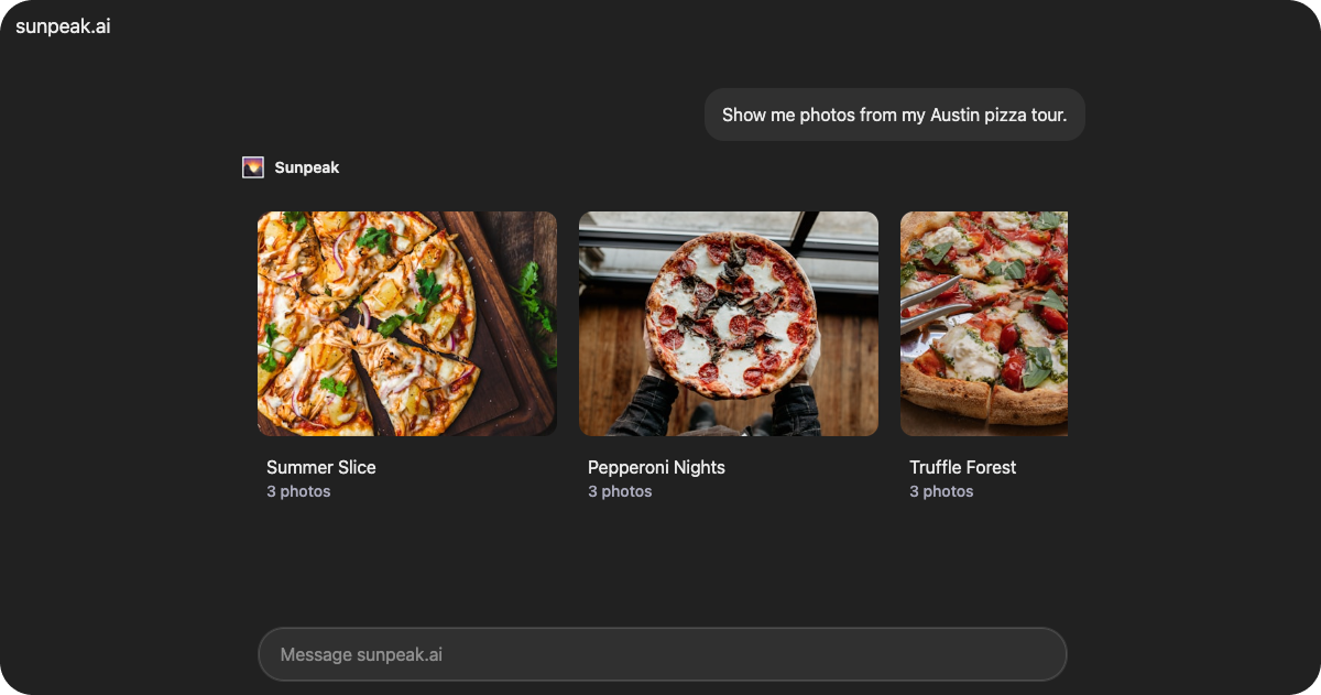
Albums is a production-ready album viewer resource included in the sunpeak framework. It displays photo albums in a carousel layout with the ability to open albums in fullscreen mode for detailed photo browsing. The component automatically switches between inline and fullscreen display modes.
The resource retrieves album data from useToolData().output and manages selection state with useAppState().
Data Structure
AlbumsData
The resource expects data in the following format viauseToolData().output:
Album[]
required
Array of album objects to display.
string
required
Unique identifier for the album.
string
required
Album title displayed on the album card.
string
required
URL to the album cover image.
Photo[]
required
Array of photos in the album.
string
required
Unique identifier for the photo.
string
required
Photo title or caption.
string
required
URL to the full-resolution photo.
Display Modes
The Albums resource has two display modes:Inline Mode (Default)
Displays albums in a horizontal scrolling carousel with album cards showing the cover image and photo count.Fullscreen Mode
When a user selects an album, the resource:- Sets the selected album ID in app state using
useAppState(). - Requests fullscreen mode via
useDisplayMode(). - Displays a fullscreen photo viewer with:
- Film strip navigation (desktop only).
- Large centered photo display.
- Automatic selection reset when switching albums.
State Management
The resource usesuseAppState() to keep the selected album in the current View and share that selection with the model on a later turn:
Features
Safe Area Support
Wraps content in the<SafeArea> component, which automatically applies device safe area padding and viewport height constraints.
Common Use Cases
- Photo gallery applications
- Portfolio viewers
- Image collection browsing
- Media library interfaces