MCP App Error Handling: Loading, Error, and Cancelled States (May 2026)
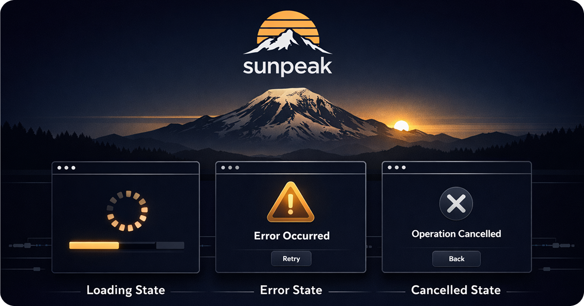
Handle every tool state in MCP Apps: loading, success, error, and cancelled.
TL;DR: The MCP Apps protocol sends four notifications to your resource: tool-input, tool-result, tool-cancelled, and tool-input-partial. sunpeak’s useToolData hook wraps these into a single React-friendly object with output, isLoading, isError, isCancelled, cancelReason, input, and inputPartial. Handle all states before rendering output. Use inputPartial during loading to show what the tool is working on. Test each state with Vitest mocks or simulation files.
Most MCP App examples look like this:
const { output } = useToolData<unknown, MyData>(undefined, undefined);
if (!output) return null;
return <div>{output.title}</div>;
That works in demos. In production, output is null for three reasons beyond “not yet loaded”: the tool failed, the user cancelled, or the tool is still running. Your component needs to handle all of them.
The Underlying Protocol
The MCP Apps protocol (@modelcontextprotocol/ext-apps, currently at v1.7.1) defines how hosts communicate with resource iframes using JSON-RPC 2.0 notifications over postMessage. Four notifications carry tool data to your resource:
ui/notifications/tool-result: deliversstructuredContent(your tool’s output) and anisErrorflag.ui/notifications/tool-cancelled: sent when the user stops the model. Includes an optionalreasonstring.ui/notifications/tool-input: delivers the complete tool call arguments once the model has finished generating them.ui/notifications/tool-input-partial: streams partial arguments as the model generates them, so you can show progress before the tool even starts executing.
The protocol also sends ui/notifications/host-context-changed when the host theme or display mode changes, though that notification is handled separately by useHostContext rather than useToolData.
You can subscribe to the tool notifications directly using the App class from @modelcontextprotocol/ext-apps (app.ontoolresult, app.ontoolcancelled, etc.). sunpeak’s useToolData hook wraps all four into a single reactive object so you don’t need to manage the subscriptions yourself.
What useToolData Returns
const { output, isError, isLoading, isCancelled, cancelReason, input, inputPartial } = useToolData<MyInput, MyData>(undefined, undefined);Each field maps to a protocol notification:
output: thestructuredContentfromui/notifications/tool-result. Non-null only when the tool completed successfully.isError: theisErrorflag fromui/notifications/tool-result. True when your tool threw an exception or returned an error.isLoading: true until atool-resultortool-cancellednotification arrives. Not a protocol field; sunpeak infers it.isCancelled: true whenui/notifications/tool-cancelledfires. The user stopped the model before the tool finished.cancelReason: thereasonstring fromui/notifications/tool-cancelled, when the host provides one. Often"user".input: the complete tool call arguments fromui/notifications/tool-input. Available once the model finishes generating arguments, beforetool-resultarrives.inputPartial: streaming partial arguments fromui/notifications/tool-input-partial. Updates as the model generates each argument. Useful for showing progress during loading.
When output is non-null, you know the tool succeeded. isLoading, isError, and isCancelled are all false.
The Loading State
MCP App hosts render your resource iframe as soon as a tool call begins, before the ui/notifications/tool-result notification arrives. The user sees your component immediately. In sunpeak, useToolData returns isLoading: true during this window, so you need to handle it from the first render.
import { useToolData, SafeArea } from 'sunpeak';
import type { ResourceConfig } from 'sunpeak';

export const resource: ResourceConfig = {
  description: 'Show a contact record',
};

interface ContactData {
  name: string;
  email: string;
  company: string;
}

export function ContactResource() {
  const { output, isLoading, isError, isCancelled } = useToolData<unknown, ContactData>(undefined, undefined);

  if (isLoading) {
    return (
      <SafeArea className="p-5 font-sans">
        <div className="animate-pulse space-y-3">
          <div className="h-5 bg-gray-200 rounded w-2/3" />
          <div className="h-4 bg-gray-200 rounded w-1/2" />
          <div className="h-4 bg-gray-200 rounded w-1/3" />
        </div>
      </SafeArea>
    );
  }

  if (isError) {
    return (
      <SafeArea className="p-5 font-sans">
        <p className="text-sm text-red-600">Failed to load contact. Try asking again.</p>
      </SafeArea>
    );
  }

  if (isCancelled) {
    return (
      <SafeArea className="p-5 font-sans">
        <p className="text-sm text-gray-500">Stopped.</p>
      </SafeArea>
    );
  }

  if (!output) return null;

  return (
    <SafeArea className="p-5 font-sans space-y-1">
      <p className="font-semibold">{output.name}</p>
      <p className="text-sm text-gray-600">{output.email}</p>
      <p className="text-sm text-gray-500">{output.company}</p>
    </SafeArea>
  );
}
The check order matters. Handle isLoading first, then isError, then isCancelled, then the !output guard. After those checks, TypeScript knows output is non-null and you can render it safely.
The loading skeleton above matches the layout of the final content so the transition feels natural. You can also use the host CSS variables for the skeleton color so it adapts to dark mode automatically:
<div
  className="animate-pulse rounded"
  style={{
    height: '1.25rem',
    width: '66%',
    background: 'var(--color-background-secondary)',
  }}
/>
Streaming Input During Loading
A generic skeleton tells the user something is loading. Streaming input tells them what is loading. While the tool runs, inputPartial gives you the model’s arguments as they stream in, so you can show context-aware feedback instead of a placeholder.
interface ContactInput {
  name: string;
  id: string;
}

export function ContactResource() {
  const { output, isLoading, isError, isCancelled, inputPartial } = useToolData<ContactInput, ContactData>(
    undefined,
    undefined
  );

  if (isLoading) {
    return (
      <SafeArea className="p-5 font-sans">
        {inputPartial?.name ? (
          <p className="text-sm" style={{ color: 'var(--color-text-secondary)' }}>
            Looking up {inputPartial.name}...
          </p>
        ) : (
          <div className="animate-pulse space-y-3">
            <div className="h-5 rounded w-2/3" style={{ background: 'var(--color-background-secondary)' }} />
            <div className="h-4 rounded w-1/2" style={{ background: 'var(--color-background-secondary)' }} />
          </div>
        )}
      </SafeArea>
    );
  }

  // ... error, cancelled, and success states
}
inputPartial updates as the model generates each argument. Once the model finishes, input has the complete arguments. Both are null before any input notification arrives.
This pattern works well for tools where the arguments include human-readable identifiers like names, titles, or search queries. For tools that only take opaque IDs, a skeleton is still the better choice.
The Error State
An error occurs when your tool handler throws an exception or when the MCP server returns a ui/notifications/tool-result with isError: true. Common causes: a third-party API call fails, a database query errors, a required parameter is missing, authentication expires.
The user experience should be honest and actionable. Don’t show a generic empty state. Show an error that tells the user something went wrong and suggests a path forward.
if (isError) {
  return (
    <SafeArea
      style={{
        padding: '1.25rem',
        fontFamily: 'var(--font-sans)',
      }}
    >
      <div
        style={{
          padding: '0.75rem 1rem',
          borderRadius: 'var(--border-radius-md)',
          background: 'var(--color-background-danger)',
          border: '1px solid var(--color-border-danger)',
          color: 'var(--color-text-danger)',
          fontSize: 'var(--text-sm)',
        }}
      >
        Something went wrong loading this data. Try asking again.
      </div>
    </SafeArea>
  );
}
Using --color-background-danger instead of a hardcoded red means this looks right in both dark and light mode across ChatGPT and Claude. The styling guide covers the full CSS variable system.
If your tool has access to error details you want to surface, pass them as structured content even on failure paths. You can return a shaped error object from your handler and check isError to decide how to render it:
// src/tools/get-contact.ts
export default async function (args: Args, _extra: ToolHandlerExtra) {
  try {
    const contact = await db.contacts.findById(args.id);
    if (!contact) {
      return {
        isError: true,
        content: [{ type: 'text', text: `No contact found with id ${args.id}` }],
      };
    }
    return { structuredContent: contact };
  } catch (err) {
    return {
      isError: true,
      content: [{ type: 'text', text: 'Database error. Please try again.' }],
    };
  }
}
In this pattern, your resource gets isError: true and output: null. The error text goes back to the model as context so it can tell the user what happened.
The Cancelled State
The host sends a ui/notifications/tool-cancelled notification when the user clicks the stop button while the model is running your tool. In sunpeak, useToolData surfaces this as isCancelled: true. The tool handler may not have completed. There is no output.
This is different from an error. The user made a deliberate choice to stop. Don’t show red. Don’t say “failed.” Show a neutral state:
if (isCancelled) {
  return (
    <SafeArea
      style={{
        padding: '1.25rem',
        fontFamily: 'var(--font-sans)',
        color: 'var(--color-text-secondary)',
        fontSize: 'var(--text-sm)',
      }}
    >
      Stopped.
    </SafeArea>
  );
}
The tool-cancelled notification includes an optional reason field. sunpeak surfaces it as cancelReason. The most common value is "user" for explicit stops. You don’t typically need to show this to the user, but it can be useful for logging.
if (isCancelled) {
  console.log('Tool cancelled:', cancelReason);
  return <SafeArea className="p-5 font-sans text-sm text-gray-400">Stopped.</SafeArea>;
}
A Complete Component
Here is a contact card resource that handles every state:
import { useToolData, SafeArea } from 'sunpeak';
import type { ResourceConfig } from 'sunpeak';

export const resource: ResourceConfig = {
  description: 'Display a contact record',
};

interface ContactData {
  name: string;
  email: string;
  company: string;
  role: string;
}

export function ContactResource() {
  const { output, isLoading, isError, isCancelled } = useToolData<unknown, ContactData>(
    undefined,
    undefined
  );

  if (isLoading) {
    return (
      <SafeArea
        style={{
          padding: '1.25rem',
          fontFamily: 'var(--font-sans)',
          background: 'var(--color-background-primary)',
        }}
      >
        <div style={{ display: 'flex', flexDirection: 'column', gap: '0.5rem' }}>
          {[['66%'], ['50%'], ['33%']].map(([width], i) => (
            <div
              key={i}
              style={{
                height: i === 0 ? '1.25rem' : '1rem',
                width,
                borderRadius: 'var(--border-radius-sm)',
                background: 'var(--color-background-secondary)',
                animation: 'pulse 2s cubic-bezier(0.4, 0, 0.6, 1) infinite',
              }}
            />
          ))}
        </div>
      </SafeArea>
    );
  }

  if (isError) {
    return (
      <SafeArea
        style={{
          padding: '1.25rem',
          fontFamily: 'var(--font-sans)',
        }}
      >
        <div
          style={{
            padding: '0.75rem 1rem',
            borderRadius: 'var(--border-radius-md)',
            background: 'var(--color-background-danger)',
            border: '1px solid var(--color-border-danger)',
            color: 'var(--color-text-danger)',
            fontSize: 'var(--text-sm)',
          }}
        >
          Failed to load contact. Try asking again.
        </div>
      </SafeArea>
    );
  }

  if (isCancelled) {
    return (
      <SafeArea
        style={{
          padding: '1.25rem',
          fontFamily: 'var(--font-sans)',
          color: 'var(--color-text-secondary)',
          fontSize: 'var(--text-sm)',
        }}
      >
        Stopped.
      </SafeArea>
    );
  }

  if (!output) return null;

  return (
    <SafeArea
      style={{
        padding: '1.25rem',
        fontFamily: 'var(--font-sans)',
        background: 'var(--color-background-primary)',
        color: 'var(--color-text-primary)',
      }}
    >
      <div
        style={{
          background: 'var(--color-background-secondary)',
          border: '1px solid var(--color-border-primary)',
          borderRadius: 'var(--border-radius-lg)',
          padding: '1rem',
        }}
      >
        <p style={{ fontSize: 'var(--text-md)', fontWeight: 'var(--font-weight-semibold)', margin: 0 }}>
          {output.name}
        </p>
        <p style={{ fontSize: 'var(--text-sm)', color: 'var(--color-text-secondary)', margin: '0.25rem 0 0' }}>
          {output.role} at {output.company}
        </p>
        <p style={{ fontSize: 'var(--text-sm)', color: 'var(--color-text-tertiary)', margin: '0.125rem 0 0' }}>
          {output.email}
        </p>
      </div>
    </SafeArea>
  );
}
Testing Each State
Unit tests with Vitest
Mock useToolData from sunpeak and return the state you want to test. Each branch of the component gets its own test:
import { describe, it, expect, vi } from 'vitest';
import { render, screen } from '@testing-library/react';
import { ContactResource } from './contact';

const mockToolData = (overrides = {}) => ({
  output: null,
  isLoading: false,
  isError: false,
  isCancelled: false,
  cancelReason: null,
  input: null,
  inputPartial: null,
  ...overrides,
});

vi.mock('sunpeak', () => ({
  useToolData: vi.fn(),
  useHostContext: () => null,
  useDisplayMode: () => 'inline',
  SafeArea: ({ children, ...props }: any) => <div {...props}>{children}</div>,
}));

import { useToolData } from 'sunpeak';

describe('ContactResource', () => {
  it('shows a skeleton while loading', () => {
    vi.mocked(useToolData).mockReturnValue(mockToolData({ isLoading: true }));
    const { container } = render(<ContactResource />);
    expect(container.querySelectorAll('[style*="animation"]').length).toBeGreaterThan(0);
  });

  it('shows an error message on failure', () => {
    vi.mocked(useToolData).mockReturnValue(mockToolData({ isError: true }));
    render(<ContactResource />);
    expect(screen.getByText(/Failed to load contact/)).toBeInTheDocument();
  });

  it('shows a stopped message when cancelled', () => {
    vi.mocked(useToolData).mockReturnValue(mockToolData({ isCancelled: true, cancelReason: 'user' }));
    render(<ContactResource />);
    expect(screen.getByText('Stopped.')).toBeInTheDocument();
  });

  it('renders contact data on success', () => {
    vi.mocked(useToolData).mockReturnValue(
      mockToolData({
        output: { name: 'Ada Lovelace', email: 'ada@example.com', company: 'Babbage Co', role: 'Engineer' },
      })
    );
    render(<ContactResource />);
    expect(screen.getByText('Ada Lovelace')).toBeInTheDocument();
    expect(screen.getByText(/Babbage Co/)).toBeInTheDocument();
  });
});
For a full walkthrough of unit testing patterns for MCP Apps, including setup and best practices, see the dedicated guide.
Testing error states with simulation files
For Playwright e2e tests, create simulation files that trigger the error branch. A simulation file with isError: true in toolResult causes the inspector to present isError: true to your resource:
{
  "tool": "get-contact",
  "userMessage": "Show me contact 999",
  "toolInput": { "id": "999" },
  "toolResult": {
    "isError": true,
    "content": [{ "type": "text", "text": "Contact not found" }]
  }
}
Save this as tests/simulations/get-contact-error.json and write a Playwright test against it:
import { test, expect } from 'sunpeak/test';

test('contact resource shows error state when tool fails', async ({ inspector }) => {
  const result = await inspector.renderTool('get-contact-error', {});
  const app = result.app();
  await expect(app.locator('text=Failed to load contact')).toBeVisible();
});
Run pnpm test and the test runs against the inspector with no paid accounts, no live API calls, and no AI credits. The same approach works for your success-state simulation alongside error and cancelled states, giving you full coverage of every branch.
When to Return null
The final if (!output) return null guard after checking the three states is a TypeScript safety net for the edge case where none of the named states are active but output has not yet arrived. In practice this should not happen in a correctly functioning host, but it prevents rendering crashes on unexpected state combinations.
Do not use if (!output) return null as a substitute for handling isError and isCancelled. If you return null on those states, the user sees nothing and has no information about what happened.
Get Started
npx sunpeak newFurther Reading
- Unit Testing MCP Apps - Vitest patterns for testing hooks like useToolData in isolation.
- E2E Testing MCP Apps - simulation file testing with the sunpeak inspector and Playwright.
- Mocking and Stubbing in MCP App Tests - patterns for mocking useToolData and protocol notifications.
- MCP App Styling: Host CSS Variables - the CSS variable system referenced in the error and loading UIs above.
- useToolData hook reference - full API docs for all seven fields including input and inputPartial.
- MCP Apps protocol specification - the @modelcontextprotocol/ext-apps standard that defines the notification types.
Frequently Asked Questions
How do I handle errors in an MCP App resource?
The MCP Apps protocol (ui/notifications/tool-result) delivers an isError flag when a tool fails. In sunpeak, the useToolData hook surfaces this as isError: true with output set to null. Render an error state UI instead of your normal content. For testing, create a simulation file with isError: true in the toolResult to trigger this branch in the sunpeak inspector and in Playwright e2e tests.
What notifications does the MCP Apps protocol send to resources?
The MCP Apps protocol (@modelcontextprotocol/ext-apps, currently at v1.7.1) sends four tool-related JSON-RPC 2.0 notifications to resource iframes over postMessage: ui/notifications/tool-result (delivers structuredContent and isError), ui/notifications/tool-cancelled (sent when the user stops the model, with an optional reason), ui/notifications/tool-input (complete tool call arguments), and ui/notifications/tool-input-partial (streaming partial arguments). It also sends ui/notifications/host-context-changed for theme and display mode updates. sunpeak's useToolData hook wraps the four tool notifications into a single reactive object.
What does useToolData return in sunpeak?
useToolData is a sunpeak React hook that wraps the raw MCP Apps protocol notifications. It returns an object with seven fields: output (structuredContent from tool-result, or null), isError (the isError flag from tool-result), isLoading (true until a tool-result or tool-cancelled notification arrives), isCancelled (true when tool-cancelled fires), cancelReason (the reason string from tool-cancelled, if available), input (complete tool call arguments from tool-input), and inputPartial (streaming partial arguments from tool-input-partial).
How do I show a loading state in an MCP App?
MCP App hosts render your resource iframe as soon as a tool call begins, before the tool-result notification arrives. In sunpeak, useToolData returns isLoading: true during this window. Render a skeleton, spinner, or placeholder. You can also use the inputPartial field to show streaming tool arguments as they arrive, giving the user context about what the tool is looking up. isLoading becomes false when either a tool-result or tool-cancelled notification arrives from the host.
What is the tool-cancelled notification in MCP Apps?
ui/notifications/tool-cancelled is a notification the host sends when the user stops the AI model before a tool completes. It includes an optional reason string (often "user"). In sunpeak, useToolData surfaces this as isCancelled: true with cancelReason. Render a neutral "stopped" state rather than an error, since the user made an intentional choice.
How do I test MCP App error states with sunpeak?
Create a simulation file in tests/simulations/ with isError: true in the toolResult field. When you run pnpm dev or a Playwright e2e test with that simulation, useToolData will return isError: true and output as null, so you can verify your error UI renders correctly without triggering a real error in production.
Should I show the same UI for error and cancelled states in MCP Apps?
No. The MCP Apps protocol distinguishes between tool-result with isError (something went wrong) and tool-cancelled (user stopped the model). Show an error message with a suggestion to try again for errors. Show a neutral "stopped" message for cancellations. The distinction keeps your UX honest about what actually happened.
Can I use the MCP Apps protocol directly without sunpeak?
Yes. The @modelcontextprotocol/ext-apps SDK provides the App class with callbacks: app.ontoolresult, app.ontoolcancelled, app.ontoolinput, and app.ontoolinputpartial. You can subscribe to these directly and manage state yourself. sunpeak's useToolData hook wraps these callbacks into a single reactive React object so you don't need to manage subscriptions manually.
