> ## Documentation Index
> Fetch the complete documentation index at: https://sunpeak.ai/docs/llms.txt
> Use this file to discover all available pages before exploring further.
# Review
> A flexible review dialog for confirmations across purchase reviews, code changes, social media posts, bookings, and more.
 ## Overview
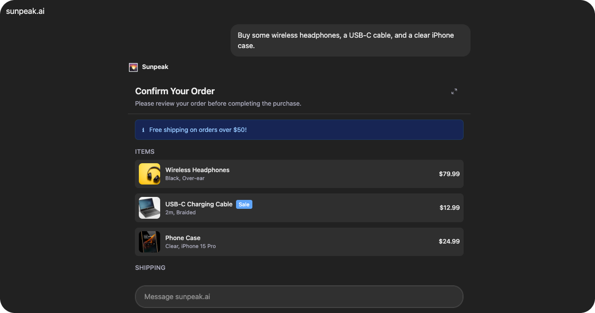
`Review` is a production-ready review resource included in the sunpeak framework. It provides a flexible confirmation dialog that adapts to various use cases including purchase reviews, code change approvals, social media post previews, booking confirmations, and generic action reviews.
The resource uses `useToolData().output` for configuration data and `useAppState()` to persist the user's decision across sessions.
## Data Structure
### ReviewData
The resource expects data in the following format via `useToolData().output`:
```tsx theme={null}
interface ReviewData {
title: string
description?: string
sections?: Section[]
alerts?: Alert[]
acceptLabel?: string
rejectLabel?: string
acceptDanger?: boolean
acceptedMessage?: string
rejectedMessage?: string
reviewTool?: ReviewTool
}
```
Main title displayed in the header.
Optional description displayed below the title.
Content sections to display. See Section Types below.
Alert messages to display at the top of the content area.
Label for the accept/confirm button.
Label for the reject/cancel button.
Use danger styling for the accept button (for destructive actions).
Message shown after the user accepts.
Message shown after the user rejects.
Optional tool configuration to call when the user makes a decision.
### Section Types
Sections support multiple display types for different content:
```tsx theme={null}
interface Section {
title?: string
type: 'details' | 'items' | 'changes' | 'preview' | 'summary'
content: Detail[] | Item[] | Change[] | string
}
```
#### Details Section
Key-value pairs for displaying structured information:
```tsx theme={null}
interface Detail {
label: string
value: string
sublabel?: string
emphasis?: boolean
}
```
#### Items Section
Items with optional images and metadata (for purchases, lists):
```tsx theme={null}
interface Item {
id: string
title: string
subtitle?: string
image?: string
value?: string
badge?: string
}
```
#### Changes Section
Code or file change entries with type indicators:
```tsx theme={null}
interface Change {
id: string
type: 'create' | 'modify' | 'delete' | 'action'
path?: string
description: string
details?: string
}
```
#### Preview Section
Simple text content display (content is a string).
#### Summary Section
Compact key-value display, typically used for totals (uses Detail\[] format).
### Alert Types
```tsx theme={null}
interface Alert {
type: 'info' | 'warning' | 'error' | 'success'
message: string
}
```
### ReviewTool
Configure a tool call to execute when the user makes a decision:
```tsx theme={null}
interface ReviewTool {
name: string
arguments?: Record
}
```
## State Management
The resource uses `useAppState()` to persist the user's decision:
```tsx theme={null}
interface ReviewState {
decision?: 'accepted' | 'rejected' | null
decidedAt?: string | null
}
```
Once a decision is made, the UI calls the backend tool via `useCallServerTool` and reads `structuredContent` from the response. The `status` field (`'success'`, `'cancelled'`, or `'error'`) determines the result color (green or red), and `message` is displayed as the result text.
## Features
### Flexible Content Sections
Supports five section types that can be combined:
* **Details**: Key-value pairs with optional emphasis
* **Items**: Card-style list with images and badges
* **Changes**: Code-review style change indicators
* **Preview**: Text content preview
* **Summary**: Compact totals display
### Alert Banners
Display contextual alerts with four severity levels:
* **Info**: Blue styling for informational messages
* **Warning**: Yellow styling for cautions
* **Error**: Red styling for problems
* **Success**: Green styling for positive confirmations
### Fullscreen Support
Includes a fullscreen toggle button using `useDisplayMode()` and `useCallServerTool()` for expanded viewing of complex reviews.
### Responsive Button Sizing
Detects touch capabilities from the host context and automatically adjusts button sizes for easier interaction on touch devices.
### Safe Area Support
Wraps content in the `` component, which automatically applies device safe area padding and viewport height constraints.
## Common Use Cases
* Purchase confirmations with item lists and totals
* Code change reviews with file diffs
* Social media post previews before publishing
* Booking confirmations with date and price details
* Generic approve/reject workflows
* Destructive action confirmations (with danger styling)
## Overview
`Review` is a production-ready review resource included in the sunpeak framework. It provides a flexible confirmation dialog that adapts to various use cases including purchase reviews, code change approvals, social media post previews, booking confirmations, and generic action reviews.
The resource uses `useToolData().output` for configuration data and `useAppState()` to persist the user's decision across sessions.
## Data Structure
### ReviewData
The resource expects data in the following format via `useToolData().output`:
```tsx theme={null}
interface ReviewData {
title: string
description?: string
sections?: Section[]
alerts?: Alert[]
acceptLabel?: string
rejectLabel?: string
acceptDanger?: boolean
acceptedMessage?: string
rejectedMessage?: string
reviewTool?: ReviewTool
}
```
Main title displayed in the header.
Optional description displayed below the title.
Content sections to display. See Section Types below.
Alert messages to display at the top of the content area.
Label for the accept/confirm button.
Label for the reject/cancel button.
Use danger styling for the accept button (for destructive actions).
Message shown after the user accepts.
Message shown after the user rejects.
Optional tool configuration to call when the user makes a decision.
### Section Types
Sections support multiple display types for different content:
```tsx theme={null}
interface Section {
title?: string
type: 'details' | 'items' | 'changes' | 'preview' | 'summary'
content: Detail[] | Item[] | Change[] | string
}
```
#### Details Section
Key-value pairs for displaying structured information:
```tsx theme={null}
interface Detail {
label: string
value: string
sublabel?: string
emphasis?: boolean
}
```
#### Items Section
Items with optional images and metadata (for purchases, lists):
```tsx theme={null}
interface Item {
id: string
title: string
subtitle?: string
image?: string
value?: string
badge?: string
}
```
#### Changes Section
Code or file change entries with type indicators:
```tsx theme={null}
interface Change {
id: string
type: 'create' | 'modify' | 'delete' | 'action'
path?: string
description: string
details?: string
}
```
#### Preview Section
Simple text content display (content is a string).
#### Summary Section
Compact key-value display, typically used for totals (uses Detail\[] format).
### Alert Types
```tsx theme={null}
interface Alert {
type: 'info' | 'warning' | 'error' | 'success'
message: string
}
```
### ReviewTool
Configure a tool call to execute when the user makes a decision:
```tsx theme={null}
interface ReviewTool {
name: string
arguments?: Record
}
```
## State Management
The resource uses `useAppState()` to persist the user's decision:
```tsx theme={null}
interface ReviewState {
decision?: 'accepted' | 'rejected' | null
decidedAt?: string | null
}
```
Once a decision is made, the UI calls the backend tool via `useCallServerTool` and reads `structuredContent` from the response. The `status` field (`'success'`, `'cancelled'`, or `'error'`) determines the result color (green or red), and `message` is displayed as the result text.
## Features
### Flexible Content Sections
Supports five section types that can be combined:
* **Details**: Key-value pairs with optional emphasis
* **Items**: Card-style list with images and badges
* **Changes**: Code-review style change indicators
* **Preview**: Text content preview
* **Summary**: Compact totals display
### Alert Banners
Display contextual alerts with four severity levels:
* **Info**: Blue styling for informational messages
* **Warning**: Yellow styling for cautions
* **Error**: Red styling for problems
* **Success**: Green styling for positive confirmations
### Fullscreen Support
Includes a fullscreen toggle button using `useDisplayMode()` and `useCallServerTool()` for expanded viewing of complex reviews.
### Responsive Button Sizing
Detects touch capabilities from the host context and automatically adjusts button sizes for easier interaction on touch devices.
### Safe Area Support
Wraps content in the `` component, which automatically applies device safe area padding and viewport height constraints.
## Common Use Cases
* Purchase confirmations with item lists and totals
* Code change reviews with file diffs
* Social media post previews before publishing
* Booking confirmations with date and price details
* Generic approve/reject workflows
* Destructive action confirmations (with danger styling)