> ## Documentation Index
> Fetch the complete documentation index at: https://sunpeak.ai/docs/llms.txt
> Use this file to discover all available pages before exploring further.
# Carousel
> A horizontal scrolling carousel for displaying multiple cards with navigation arrows and smooth transitions.
 ## Overview
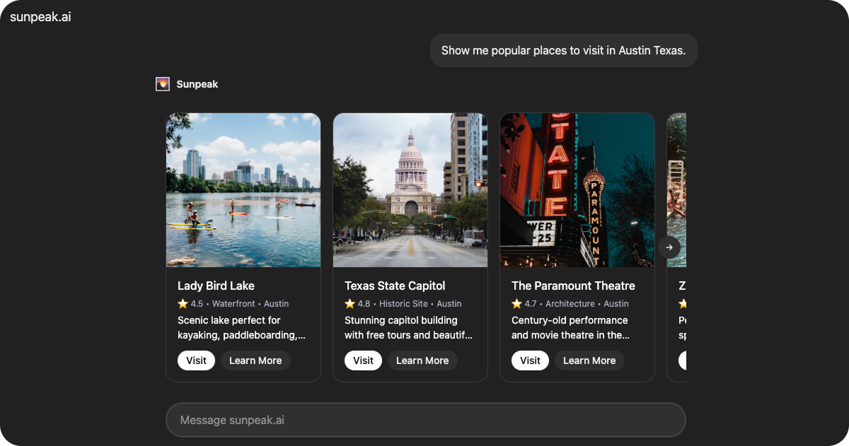
`Carousel` is a production-ready carousel resource included in the sunpeak framework. It displays places or items in a horizontal scrolling carousel with card components, featuring navigation arrows, edge gradients, and interactive buttons.
The resource retrieves place data from `useToolData().output` and adapts button sizes based on device capabilities.
## Data Structure
### CarouselData
The resource expects data in the following format via `useToolData().output`:
```tsx theme={null}
interface CarouselData {
places: CarouselCard[]
}
interface CarouselCard {
id: string
name: string
rating: number
category: string
location: string
image: string
description: string
address?: string
phone?: string
hours?: string
priceRange?: string
highlights?: string[]
tips?: string[]
}
```
Array of place objects to display in the carousel.
Unique identifier for the place.
Place name displayed in the card header.
Rating value displayed in the metadata.
Category type displayed in the metadata.
Location displayed in the metadata.
URL to the place image.
Description text displayed in the card body.
Street address, shown in the fullscreen detail view.
Phone number, shown in the fullscreen detail view.
Operating hours, shown in the fullscreen detail view.
Price range indicator (e.g. "Free", "\$\$"), shown as a badge in the detail view.
List of highlight tags displayed as badges in the fullscreen detail view.
List of tips displayed in the fullscreen detail view.
## Features
### Carousel Navigation
Displays cards in a horizontal scrolling carousel with:
* Navigation arrows for browsing
* Edge gradients to indicate more content
* Smooth scroll transitions
* Configurable card width (220px default)
* 16px gap between cards
### Interactive Cards
Each card includes:
* Image display with alt text
* Header with place name
* Metadata showing rating, category, and location
* Description text
* Two action buttons (Visit and Learn More)
Clicking a card or its "Learn More" button opens a fullscreen detail view. The primary "Visit" button triggers its own action without opening fullscreen.
### Fullscreen Detail View
When a card is clicked, the resource requests fullscreen mode and displays a detail view with:
* Centered hero image (preserves aspect ratio, never stretched)
* Star rating and category/price badges
* Full description text
* Info grid with address, hours, and phone when available
* Highlight tags displayed as colored badges
* Tips displayed as a styled list
* Action buttons (Visit, Learn More)
The detail view relies on the host's built-in close button to return to the inline carousel. When the host switches back to inline mode, the carousel automatically re-renders without needing explicit back navigation.
### Responsive Button Sizing
The resource detects touch capabilities from the host context and automatically adjusts button sizes for easier interaction on touch devices.
### Safe Area Support
Wraps content in the `` component, which automatically applies device safe area padding and viewport height constraints.
## Common Use Cases
* Product galleries
* Place recommendations
* Restaurant or venue listings
* Travel destination browsing
* Service provider showcases
## Overview
`Carousel` is a production-ready carousel resource included in the sunpeak framework. It displays places or items in a horizontal scrolling carousel with card components, featuring navigation arrows, edge gradients, and interactive buttons.
The resource retrieves place data from `useToolData().output` and adapts button sizes based on device capabilities.
## Data Structure
### CarouselData
The resource expects data in the following format via `useToolData().output`:
```tsx theme={null}
interface CarouselData {
places: CarouselCard[]
}
interface CarouselCard {
id: string
name: string
rating: number
category: string
location: string
image: string
description: string
address?: string
phone?: string
hours?: string
priceRange?: string
highlights?: string[]
tips?: string[]
}
```
Array of place objects to display in the carousel.
Unique identifier for the place.
Place name displayed in the card header.
Rating value displayed in the metadata.
Category type displayed in the metadata.
Location displayed in the metadata.
URL to the place image.
Description text displayed in the card body.
Street address, shown in the fullscreen detail view.
Phone number, shown in the fullscreen detail view.
Operating hours, shown in the fullscreen detail view.
Price range indicator (e.g. "Free", "\$\$"), shown as a badge in the detail view.
List of highlight tags displayed as badges in the fullscreen detail view.
List of tips displayed in the fullscreen detail view.
## Features
### Carousel Navigation
Displays cards in a horizontal scrolling carousel with:
* Navigation arrows for browsing
* Edge gradients to indicate more content
* Smooth scroll transitions
* Configurable card width (220px default)
* 16px gap between cards
### Interactive Cards
Each card includes:
* Image display with alt text
* Header with place name
* Metadata showing rating, category, and location
* Description text
* Two action buttons (Visit and Learn More)
Clicking a card or its "Learn More" button opens a fullscreen detail view. The primary "Visit" button triggers its own action without opening fullscreen.
### Fullscreen Detail View
When a card is clicked, the resource requests fullscreen mode and displays a detail view with:
* Centered hero image (preserves aspect ratio, never stretched)
* Star rating and category/price badges
* Full description text
* Info grid with address, hours, and phone when available
* Highlight tags displayed as colored badges
* Tips displayed as a styled list
* Action buttons (Visit, Learn More)
The detail view relies on the host's built-in close button to return to the inline carousel. When the host switches back to inline mode, the carousel automatically re-renders without needing explicit back navigation.
### Responsive Button Sizing
The resource detects touch capabilities from the host context and automatically adjusts button sizes for easier interaction on touch devices.
### Safe Area Support
Wraps content in the `` component, which automatically applies device safe area padding and viewport height constraints.
## Common Use Cases
* Product galleries
* Place recommendations
* Restaurant or venue listings
* Travel destination browsing
* Service provider showcases